Neuro Motion — Logo Design
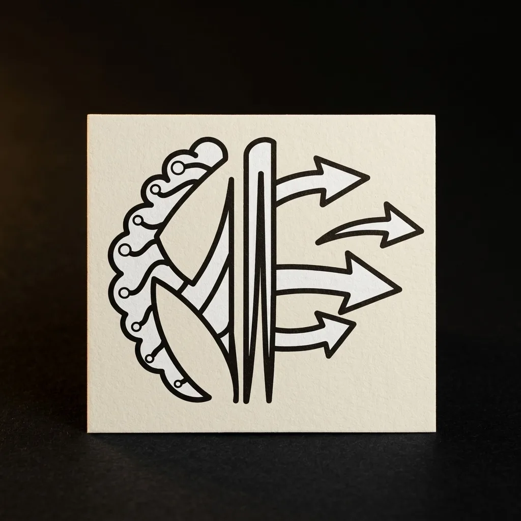
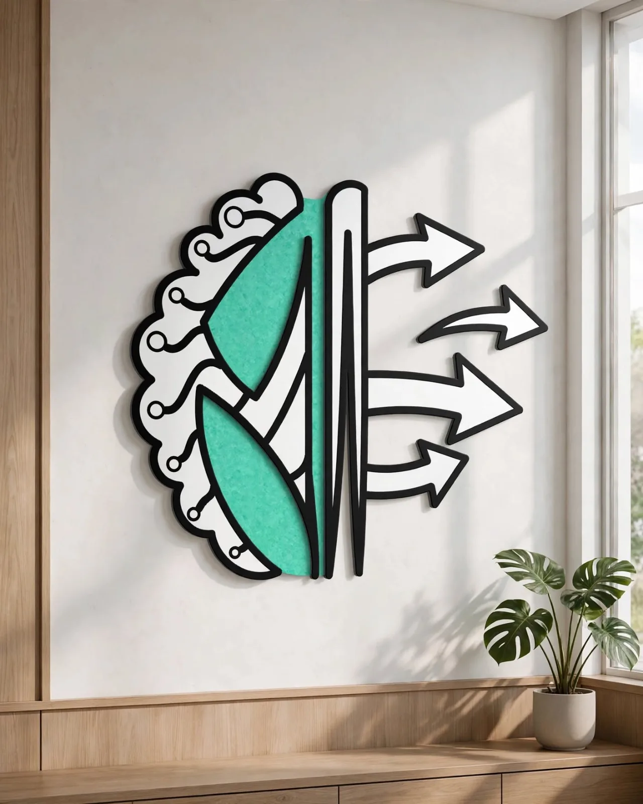
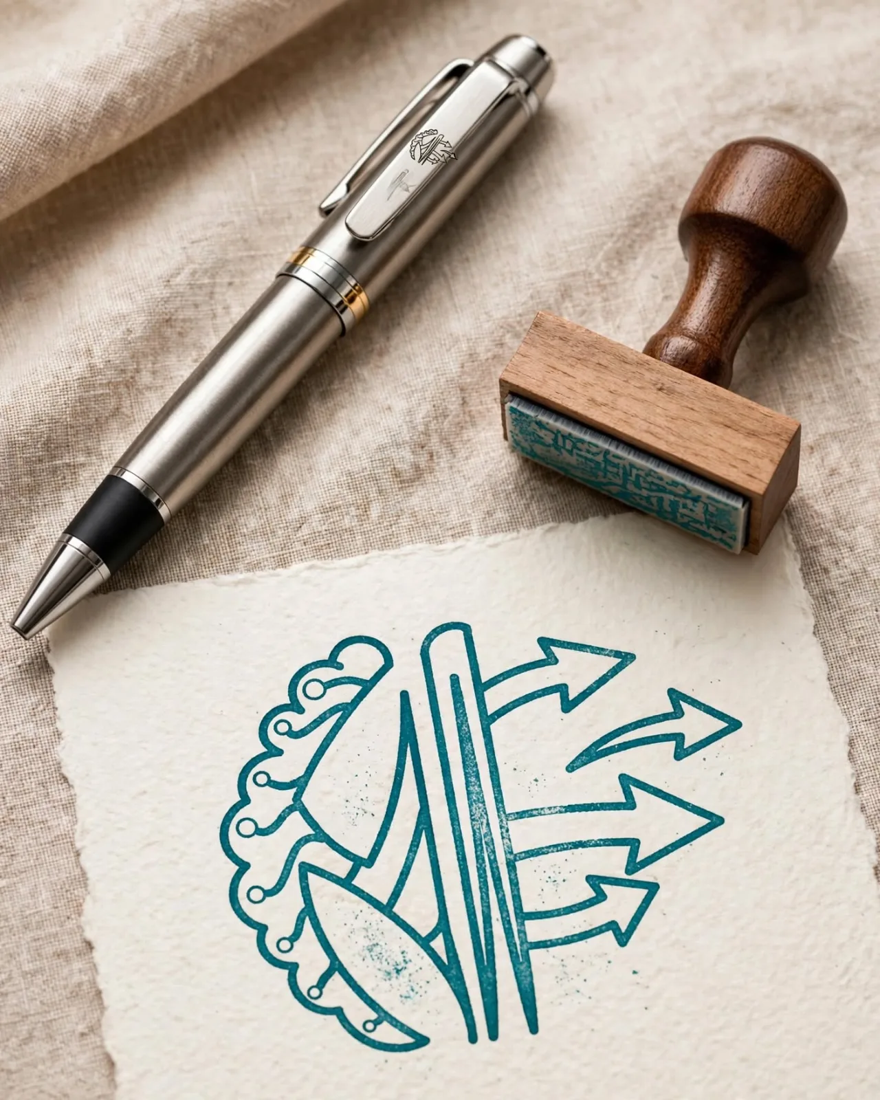
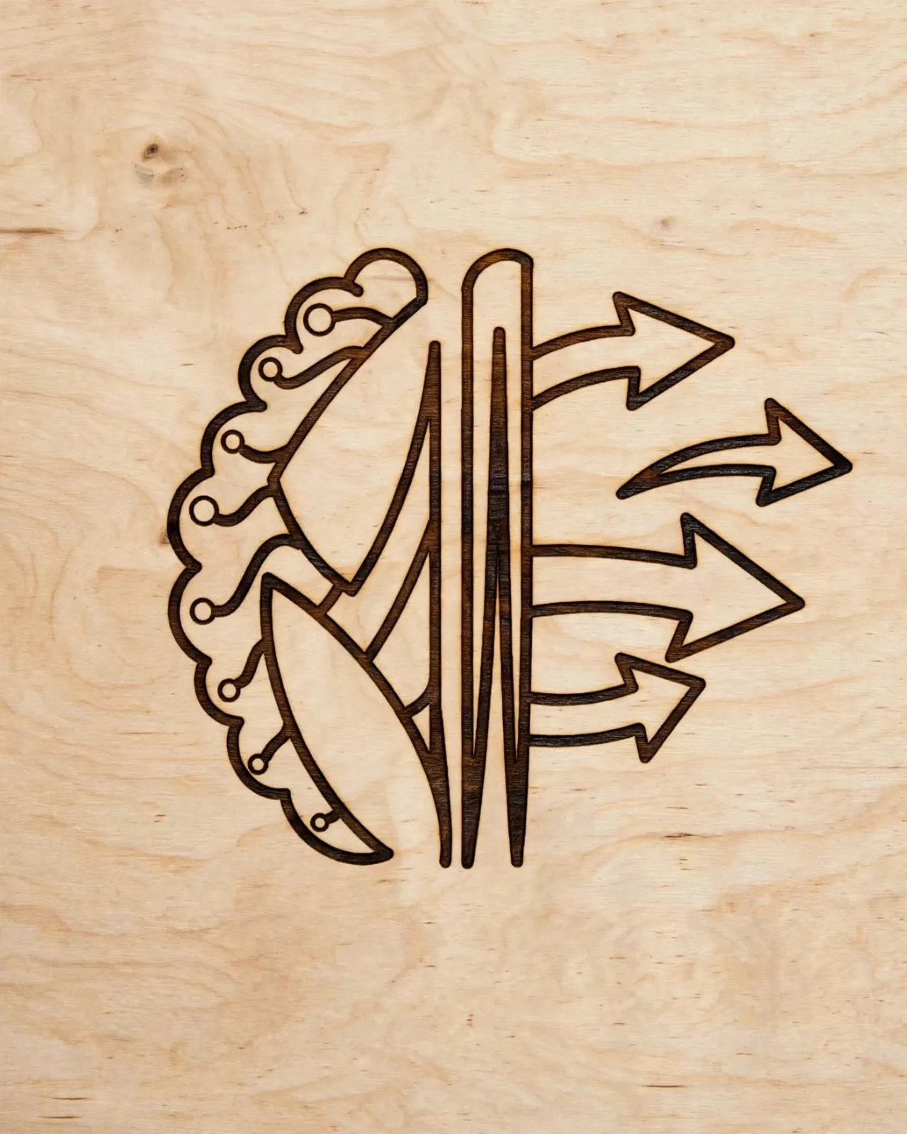
A logo for a motion graphics studio that combines a brain and motion arrows into one mark built from the letters N and M — intelligence and movement at first glance.
The Challenge
The client specializes exclusively in motion graphics, so the core challenge was to create a visual identity and logo that communicates the nature of the service at first glance.
The logo had to strike a careful balance between several goals:
- Clearly express motion and movement.
- Suggest intelligence and creativity, in line with the brand name.
- Be distinctive and memorable without visual clutter.
- Stay simple — but not so simple that it loses its personality and meaning.
The goal was not just an attractive logo, but a symbol that captures the brand's identity and specialty in a single visual element.
The Solution
We developed a mark that brings Neuro + Motion together in one composition, using the letters N and M in a deliberate, symbolic way.
The N is inspired by the left half of the brain — a reference to thinking, logic and intelligence — while the arrows on the opposite side express motion, dynamism and progress.
The result is a logo that does several jobs at once:
Intelligence + Motion + Brand identity
We kept the design visually balanced so it stays clear and memorable without becoming complex or so abstract that it loses its meaning.
The Result
The design matched the client's vision closely and expressed exactly the image they wanted to build for the brand.
The client said that at first glance the logo gave a clear sense of motion and intelligence — the two core messages behind their specialty and what they want their audience to remember.
The outcome is more than a logo carrying the letters NM: it is a visual identity that sums up the service and the message behind the brand in a single symbol.